App Sec & Dev Ops
Traceable
WEBSITE CASE STUDY
We love to help founders visualize their product and launch it to the world. When Traceable asked us to build a face for their brand, we jumped at the chance to introduce their unique product to market. It was in their heads but we needed to tease it out
The opportunity
Ready for launch
Traceable is a security platform that provides end-to-end application security for cloud-native applications. Their powerful machine learning system continuously traces to identify normal application behaviour and automatically detect suspicious, abnormal activity.
The Traceable team came to us in stealth mode for a visual identity, logo and website for their launch. Their Co-Founder, Jyoti had worked with us on the Unusual Ventures website and were excited to see how we would visually bring their product to life. They had a category-defining product that required significant education. It needed to connect with both developers and security teams and couldn’t resort to fear tactics.
Our Strategy
The challenge
A balance of communication
Weaving in humanity requires a balance of technical product explanation and an approachable tone. But how do we educate users on new technology in a compelling and unique way? We knew we didn’t want to use fear tactics, but the messaging still needed to educate and resonate with development and security teams.
This was particularly difficult when Traceable’s product was still being fine-tuned. The evolving nature of being in stealth meant we couldn’t rely on established UI or a firm featureset to sell the product.
The research
Digging into audience
A key Traceable value proposition is eliminating workplace friction between its two key audiences, developers and security executives. We started by digging into audience research to learn about the pain points of these two groups and their day-to-day interactions. What do they care about and why?
Keyword research gave us insight into the topics that resonated best with each audience. We discovered that certain terms were well established in the industry, but were not ranked competitively. This gave Traceable an advantage in SEO and built a foundation for common understanding.
In looking at Traceable’s competitors’ websites, we also noticed an immediate lack of humanity in both imagery and tone. There were hardly any photos of people. Instead, almost every competitor was using stock imagery in a fear-based, alarmist approach. We needed more approachable product visualization.
The direction
On the right trace
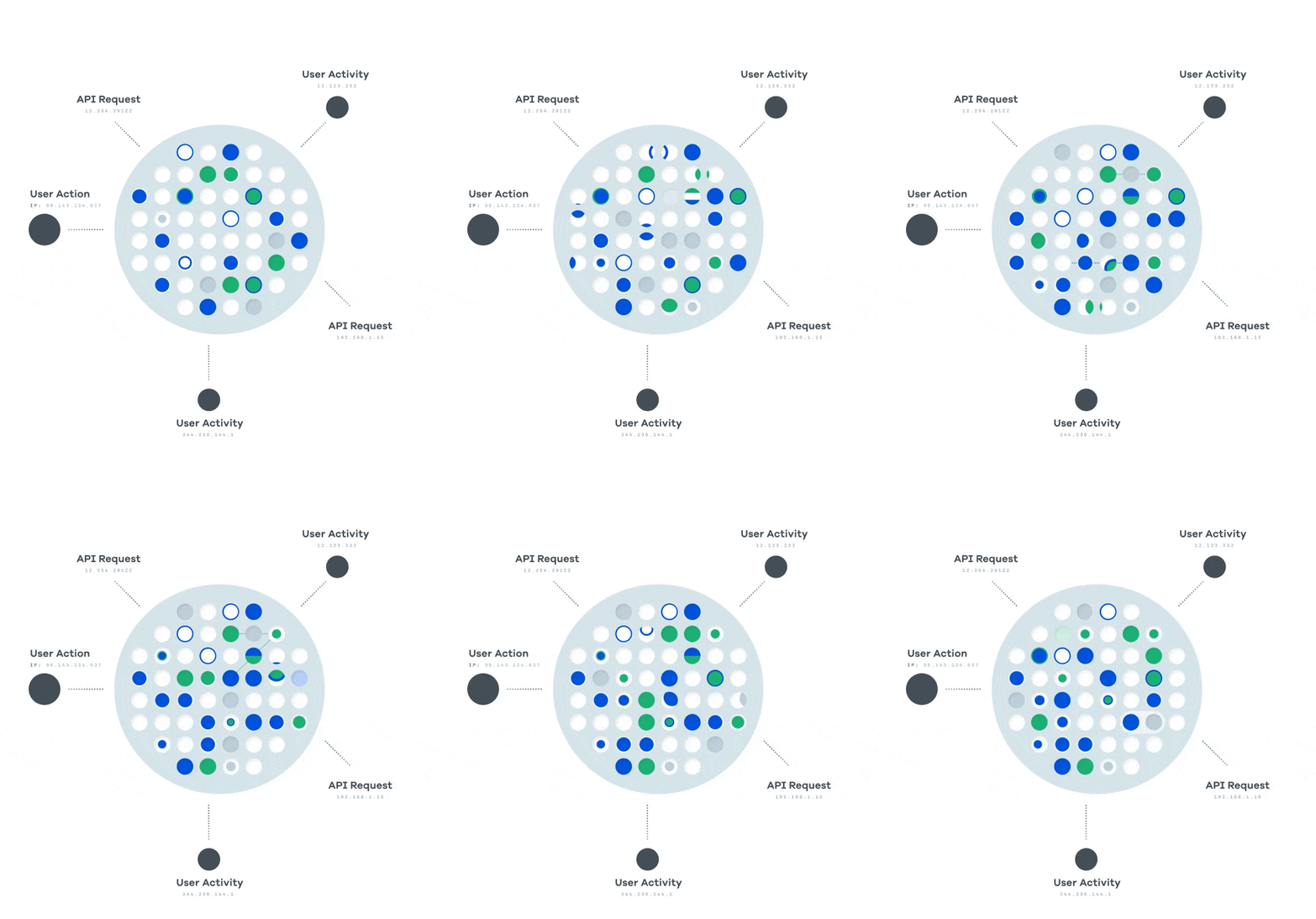
We knew their website would need a blend of photography, unique product visualization, and stylized UI to appeal to both audiences. We started with animated illustrations to show the chaos across microservices and how easy it is to miss suspicious behavior. This was a key education piece for the product given its unique approach in the space.
Next, we knew developers would be looking for images of the actual platform on the Product page. Unfortunately, the Traceable team was still creating the product UI so we had to get creative. We took screenshots of the existing UI and stylized them for a more polished, professional look.
Lastly, we used photography and approachable design to balance the technical education. We showed teams working together and even added some humor on the About page with GIFs on hover, showing the team’s personalities.
Our Solution
The moral of the story
To another website and beyond
Traceable recognized our ability to step into the shoes of their customers and take vision into execution. In this case, they hired us half way through the project to build a second visual identity, logo and website for the open source element of their product. Both were aligned for launch. Check out the Hypertrace website here. Months later they reached out again for help redesigning the UI on their product.
“Thank you so much guys for taking care of all these (Traceable & Hypertrace). These are going to be among the best websites ever for a company just coming out of stealth!”
Jyoti, CEO & Co-founder of Traceable
“Without you guys we couldn't have done it. Look forward to more involvement going forward.”
Sanjay, CTO & Co-founder of Traceable
“Awesome to see things in action!
Looks beautiful.”
Michael Spiegel, Director of Design at Traceable


